Justice Society of America #10 // Review
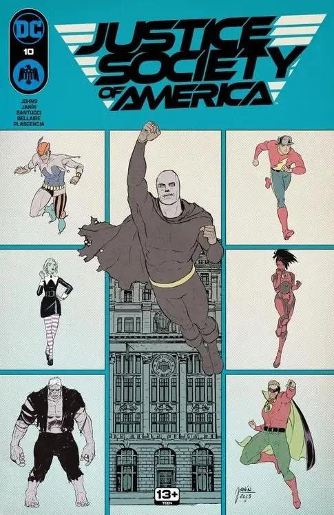
The Huntress is being hunted. Ruby is looking for her father and it doesn’t matter who stands in her way. If finding him means that the Huntress has to die, then that’s what’s going to have to happen in Justice Society of America #10. Writer Geoff Johns weaves a very intricate plot that is conjured to the page with considerable talent and flair by the art team of Mikel Janin and Marco Santucci. An impressively immersive color washes over the page courtesy of Jordie Ballaire, Ivan Plascencia and John Kalisz. Though the story has a hell of a lot going on in it, the art has little difficulty drawing the reader-in to the emotional intensity of the complexity.
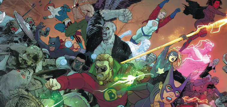
The Leaion of Substitute heroes is a bit concerned. There are those among them who feel as though they might not be cut out for the work ahead of them. Nevertheless, it IS possible that The Justice Society might be a danger to all of reality. The Huntress doesn’t have time to convert with herself about this. She’s with a mixed JSA that’s fending-off an attack by a rather uncomfortably large group of undead warriors under the command of Gentleman Ghost.
Johns had been able to modulate the complex layers of history in the DC multiverse. By the time the temp issue sets in, there's way too much going on. It's far too cluttered. Where as the first several issues would have been difficult to follow for anyone not familiar with quite a lot of the lower of the DC universe, there was a dramatic foundation for everything that just about anyone could get into it. By the time the 10th issue hits, it's all more or less in penetrable with a decent amount of familiar with what's going on. The narrative suffers as a result and tends to be a lot of relatively dry exposition being spoken in dialogue throughout the issue.
Mikel Janin and company bring the story to the page intensity and action and dramatic weight that feels a lot more intense than it has any right to be. Janin has a great talent for placing a large number of characters on the page in a way that respects each of them for being a distinct personality. This is true of large splash, pages and more intimate scenes as well. It all comes to the page with added death and atmosphere, thanks to the work of a number of colorist who are considering all of the sources of light and illumination that would impact the visual reality of what's being brought to the page. In places, this is kind of jaw-droppingly immersive. Johns’ work has reached a stage where it’s clearly only reaching-out to the group of people who are aware enough about what’s going on to be able to follow the complex convolutions of the story and its mass of extended characters.
It's going to be more difficult for many people to follow. But it's still really fun. There is such an intensity of activity that goes into every single page in the issue that it just feels like it could've been a handle better, but it doesn't feel as awkward as the larger group scenes in so many of the mega crossovers that DC has put to the page in the past, including about Crisis they’ve ever published. Johns knows what he’s doing, but what he’s doing is for a decidedly smaller subset of the comic book reading public than most mainstream comics.


