Wonder Woman: Evolution #2 // Review
Diana awakens in a familiar field. A little Diana of youth taunts her in the fields of Themyscira. Things get a little weird from there in Wonder Woman: Evolution #2. Writer Stephanie Phillips weaves a dark and dreamy second chapter of the eight-part series brought to the page by penciler Mike Hawthorne and inker Adriano DiBenedetto. Colorist Jordie Bellaire does a beautiful job of casting an intriguingly strange twisting of a halcyon haze through the story's visuals. Having shrugged aside the introductory chapter, the second part of Evolution establishes the flow and rhythm that will likely roll through the remaining six installments of the series.
Diana is chasing herself somewhere in Themyscira. But it's not Themyscira. And she's not chasing herself. She's chasing a child named Diana, who is a strange reflection of some part of herself. Somewhere amid the chase, she finds herself overlooking an empty Themyscira. No one else seems to be around save for a single man with a rifle who turns out to be Steve Trevor. Only he isn't Steve Trevor. He's Diana's first test. If Diana is looking for answers, she's going to have to find them on the other side of a dangerous conflict with a man who has the strength of a god.
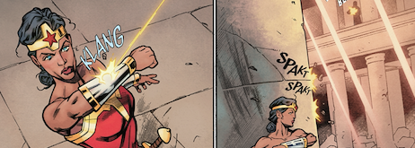
Phillips' opening chapter had to move through quite a few establishing scenes to get to where the series is in the second issue. The conflict between Wonder Woman and the Steve Trevor construct is given plenty of time to play out in delicately choreographed action. The bulk of the issue is a single encounter between Wonder Woman and a villain wearing the image of a love interest. The simplicity of the second issue allows for a compelling fusion between script and art for the second issue of the series.
Hawthorne has done a tremendously impressive job of bringing across the dreamy solitude of the story. The field of tall grasses at the story's opening feels lush and encompassing. The establishing shot of a vacant Themyscira is kind of a breathtaking architectural splash. DiBenedetto provides just the right embellishment in and around the edges of everything to allow for an engaging visual texture to the action. Bellaire does gorgeous things with the light in the issue. Distant landscapes are covered in a beautiful mist. Shafts of light contrast against the billowing clouds of a dusty temple. Through it all, the Lasso of Hestia glows radiantly amidst the sheen of Wonder Woman's armor.
With the basic premise of the series mentioned in all of the promotional blurbs for the series, it's interesting that Diana doesn't make it to the central premise of the series until the final page of the second issue. Phillips has taken her time gathering all the right thematic elements. Everything should begin to roll into the trial at the center of the series. Now begins the real test for the hero and the creative team that is telling her story.
Grade: B+


